Exploratory plots
State Comparison
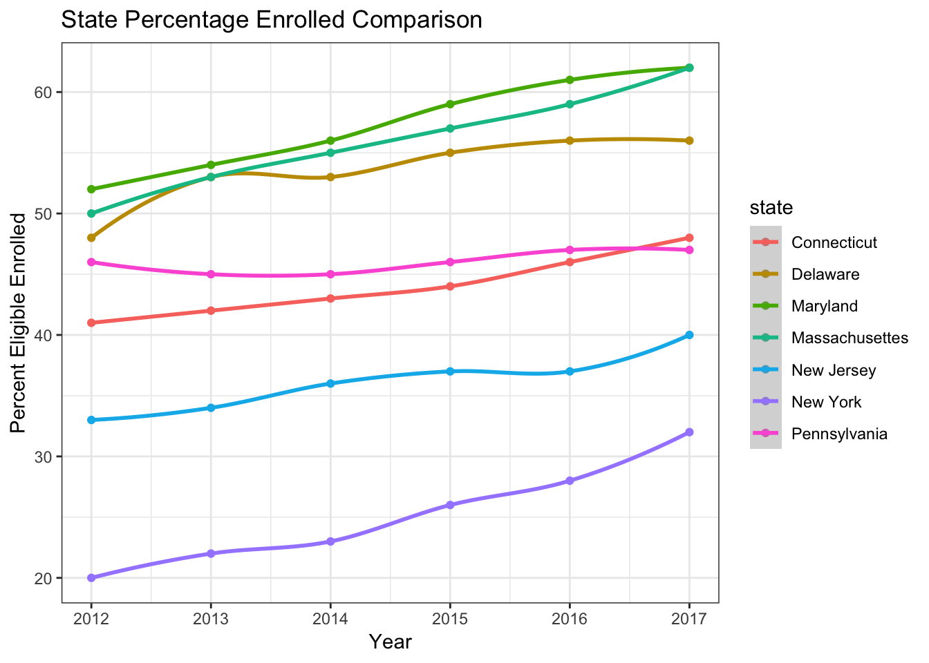
This plot includes states near New York. New York’s percentage of eligible people enrolled in 2017 was 8 percentage points lower than the next lowest of these states.
Enroll Number vs County Pop
Number of enrollment increases as NY’s counties population increse.
Percent Enroll vs County Pop
The NY’s counties with the lowest enrollment tend to be in the New York City area. The larger counties have lower registration rates, which is problematic, since larger counties have the potential to provide the most organs.
Registration Over Time
In NY state the registry enrollments showed a generally increasing trend across the years. However, note that there is a sudden change in registry enrollments on 2009-06-01 and 2017-10-1. Curiously, the enrollment even declined for some counties on 2017-10-1, which indicates an aspect of limitation of the dataset.
This plot shows the trend of registration rate from 2008 to 2018 for counties in New York State. Note that the registration rates for Counties Cattauragus and St Lawrence were not updated throughout the years.
There was a huge leap in pupulation_18_estimate at 2017-10-01 among almost all the counties